UBCO Pritchard Servery and Dining Facility
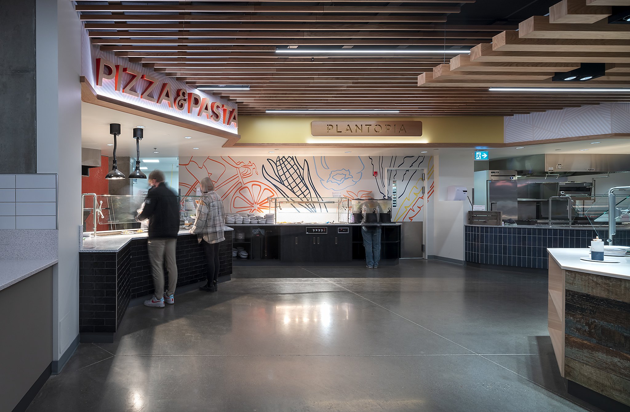
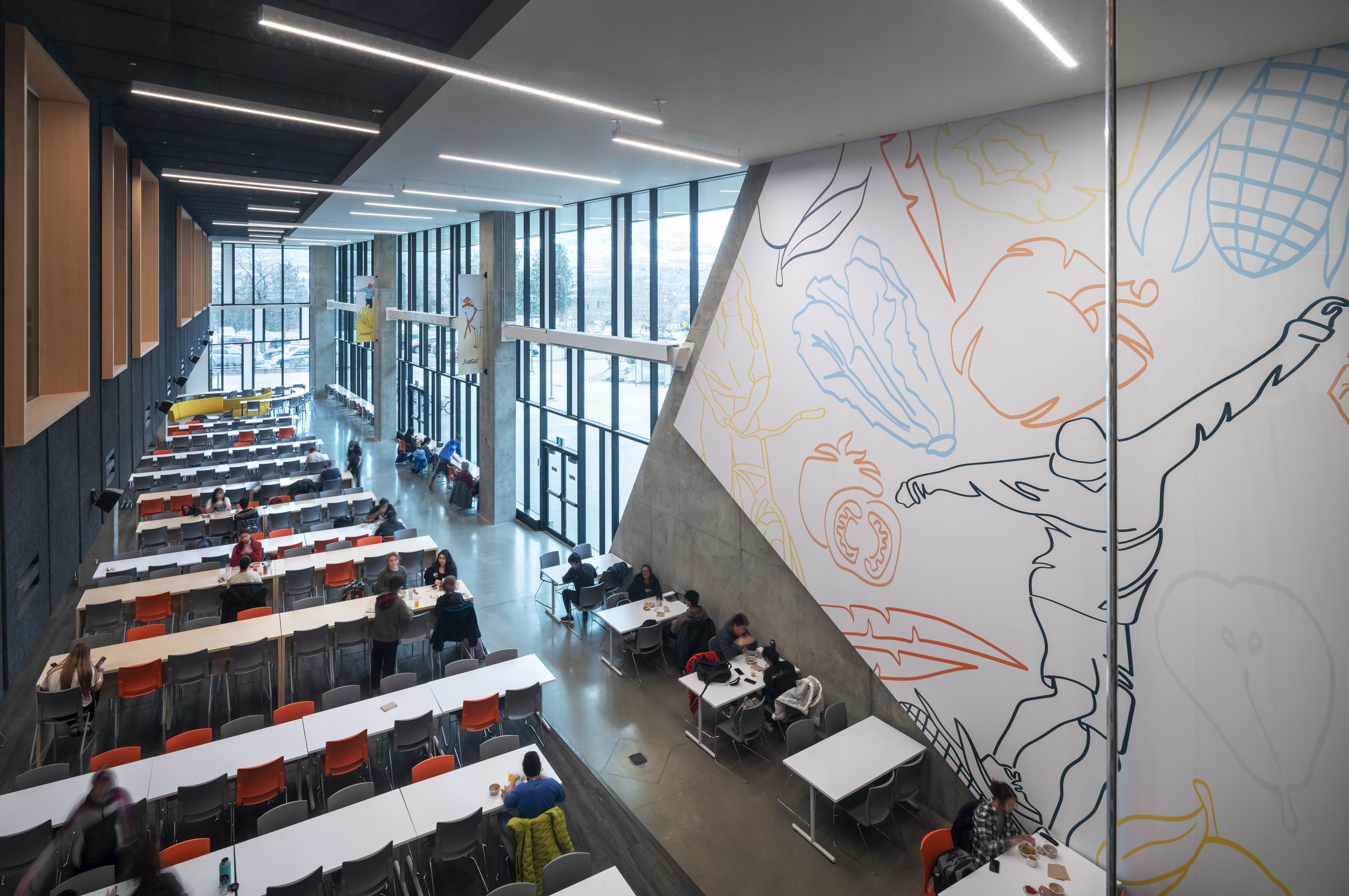
Located at the University of British Columbia Okanagan’s Nechako student residence is the state-of-the-art Pritchard dining facility. Guests are invited to select from a diversity of food options available at multiple stations throughout the servery, and then gather to eat in a community-oriented setting of the dining room. A mix of public and intimate seating arrangements create an inviting experience within a world-class building, featuring soaring walls of glass, with warm and colourful interior features.

Welcoming the world,
with a local flavour

What happened/What we did
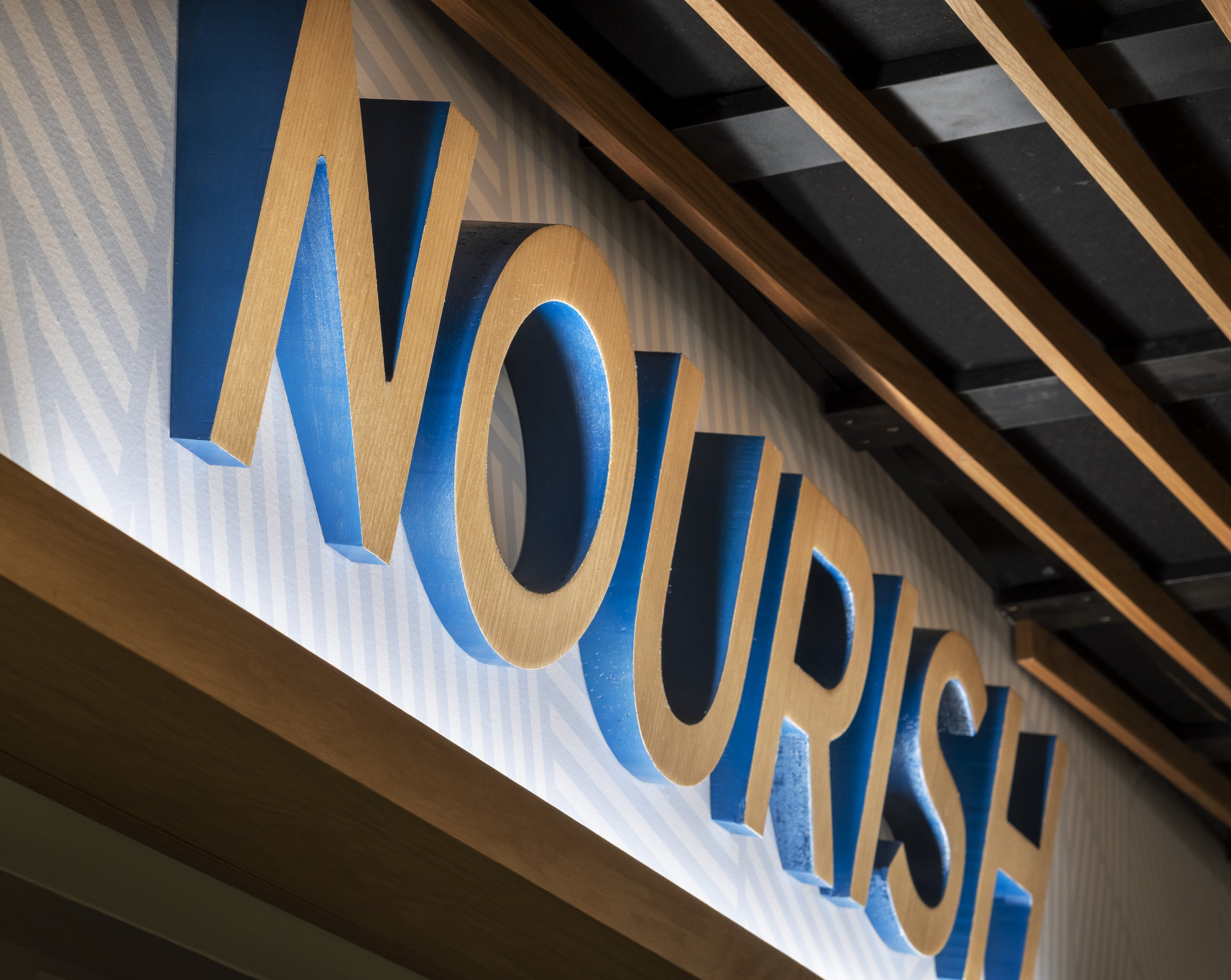
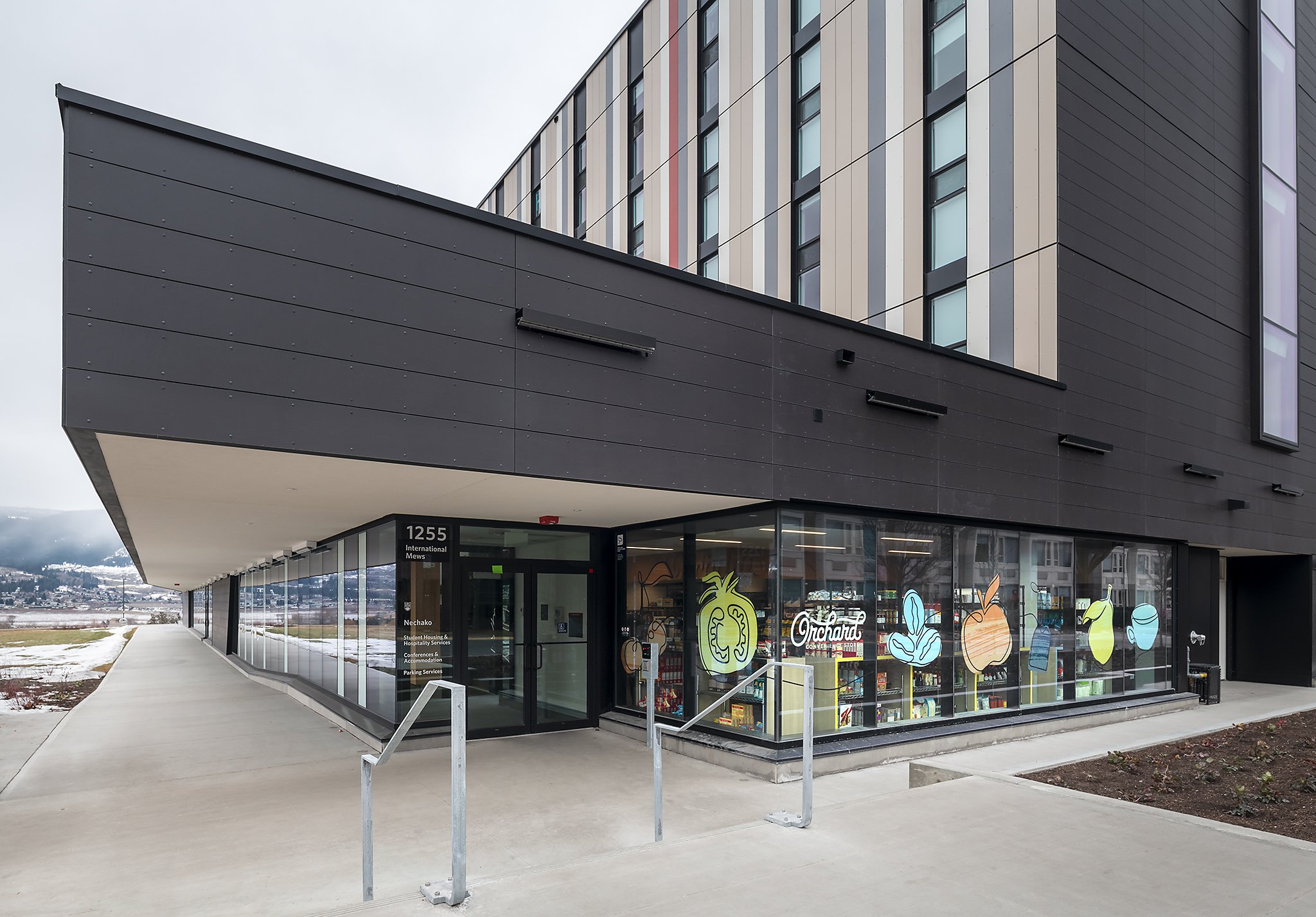
We were tasked with developing a comprehensive interior design and branding package for the almost 500 seat student dining hall, and convenience store in the newly built Nechako Residence building.
The dining area is 8000 square feet, the servery is 3500 square feet and the store 950 square feet. The Pritchard Dining Hall features a unique all-you-care-to-eat dining experience. Guests are invited to select from a diversity of food options available at multiple stations throughout the servery, allowing them to customize their choices.
The Pritchard Dining Hall and the Orchard Convenience Store mainly services students from eight different residence buildings, all within an eight-minute walking distance.


Local, national, global
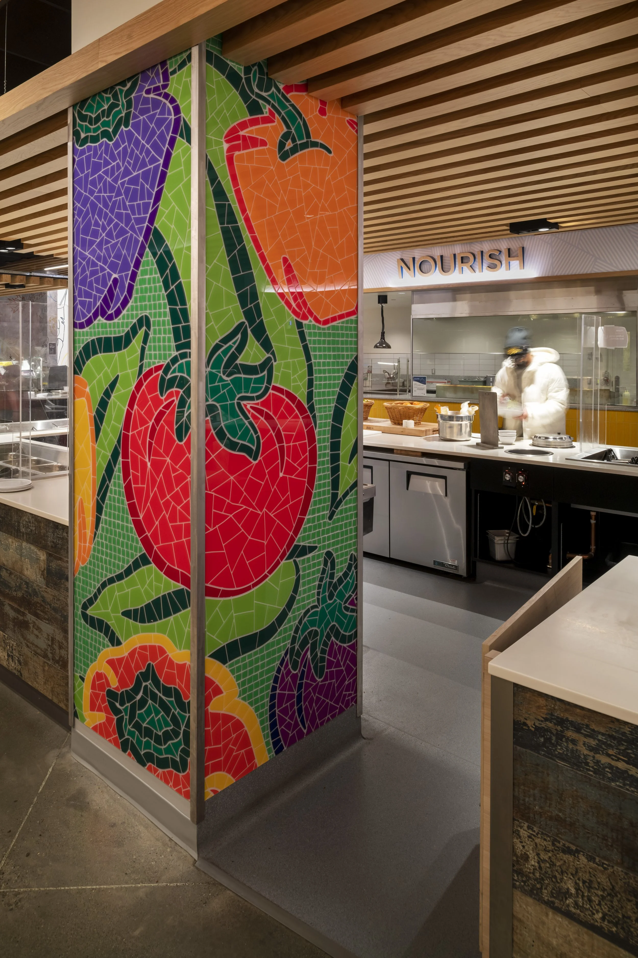
Taking a cue from the adjacent agricultural landscape and the namesake donor family history, the new Pritchard Dining Hall and Orchard Store uses natural materials and textures that reflect the uniqueness of the Okanagan. Knowing that the student population is an equal blend of BC, national, international, our approach was to create spaces and branding which foster social interaction and warmth.
Much was said, during the concept development workshop, about colour, texture and light, and all stakeholders agreed that these should reflect the Okanagan and contrast wood and natural materials with stronger pops of colour.
The foundation of the concept was driven by creating a local market experience. The concept of a local market is reflected in the use of materials, from woods and tiling to the patina and textured finishes. Similarly, the illustration style was designed to be loose, approachable and familiar, adding to the comfort and warmth of the servery, seating area and store. In balance, we provided a clean and modern look to the typography, with clearly presented information and demarcation.

Challenging the status quo
“In terms of user experience, the team was looking for ways to make it different from the usual “cafeteria” transactional one. This was the challenge for both the interior design team and branding design team to look at creating a unique experience.”
Outcome
The project has been very well received by the students and staff alike at both the Okanagan campus and at the main campus in Vancouver. Students and staff have noted the uniqueness, quality, and design notes of the dining hall and store, and enjoy the casual energy of both spaces. The spaces are easy to navigate and have a welcoming feel, as many of the students are far from home – some for the first time. Seeing how these spaces are used confirms that the interior design and branding objectives were not only met, but surpassed expectations in relation to managing resources with value-engineering, emphasis on delivering quality at every brand touchpoint, and ensuring that client concerns were addressed with clear communication and pivots made to ensure timely delivery.
