British Columbia’s Office of the Human Rights Commissioner
Everything in this brand identity is about people. It is about hope and fairness. The British Columbia Office of the Human Rights Commissioner is a bit of an anomaly in the world of government. Rather than being a reactive resource for trouble, The BCOHRC has made its mandate one of prevention of human rights abuses. It focuses on a position of authority for credible information rather than legal power. It works at preventing inequality and discrimination before they happen by getting at the social stigmas and structures that allow such issues to exist. The OHRC is looking towards a future where it isn’t needed. Rather than being viewed as a legal arm of the government, the OHRC wants to be seen as positive and humanistic. They want to connect to the disenfranchised with an empathetic tone.

What happened/What we did
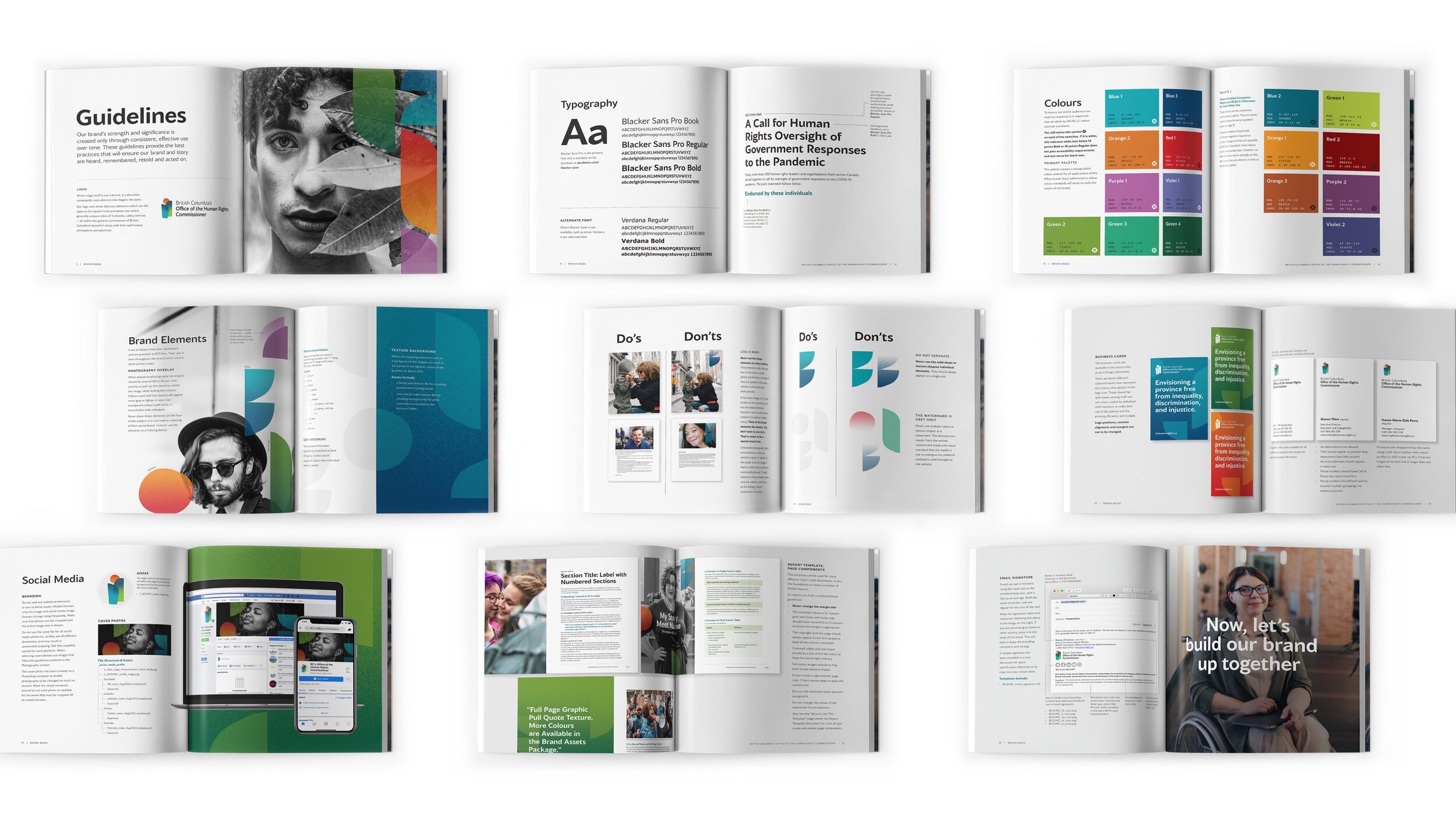
And all of this is about doing things differently. We worked with the OHRC to explore the things that resonated with these unique attributes and primary goals. The word “human” is not only in the name, but the state of being human is central to everything related to the OHRC. This logo is open to interpretation as a human figure or figures, trees, and sun, or interplay between two parties. What it feels like, though, is warm and just a little bit light — unlike other government entities people have dealt with before.


Outcome
In design, there is never a straight line between the problem and the solution. In the exploration of the possibilities, there are many potential outcomes, sometimes obvious and — more interestingly — surprising. We captured these surprises and tried to lift them to the surface. The OHRC was willing to go down the path less travelled, which came out of a democratic process that truly was artful and fresh.


